IRO
A brand new visual identity for a matcha tea specialist
A new brand, a premium positioning, strong values – this is IRO, an exceptional matcha tea specialist. Its promise: to accompany the consumer on a journey of self-discovery.
Our communication agency in Brussels had the opportunity to work closely with IRO to highlight their unique offering of Japanese teas. Our mission: to create attractive and eco-friendly packaging that reflects the essence of Japanese tea – purity, tradition, and refinement.
Associated service
Keywords
- Brand image
- Visual identity
- Design
- Packagings
- Communication media
1
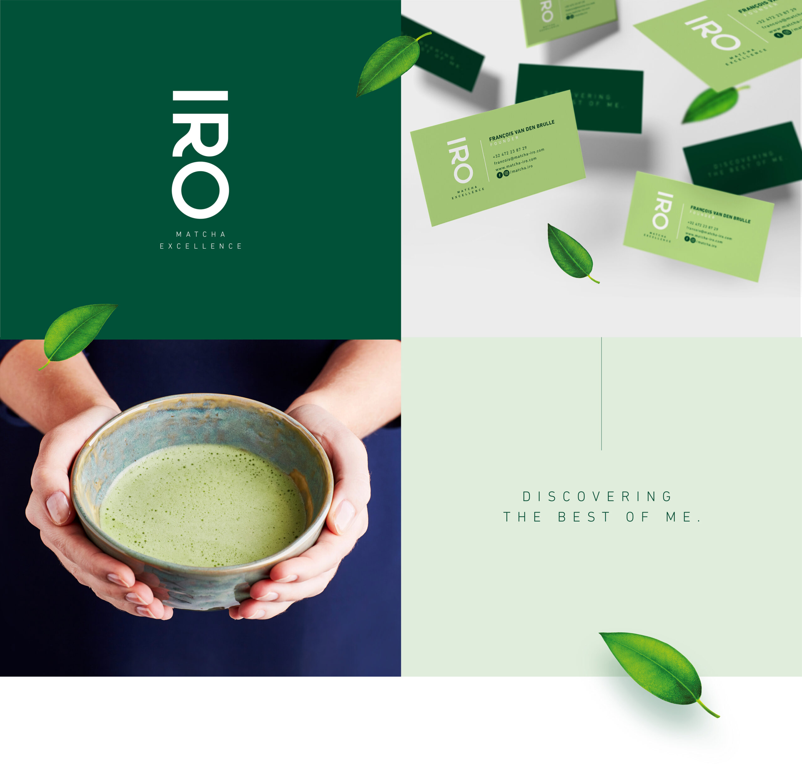
Elegance and Japanese essence
A brand between refinement and Japanese heritage
IRO’s visual identity is sober, modern, and minimalist, driven by the desire to adhere to the clean codes of luxury and because IRO appeals to hedonists. To stay true to the product’s roots, we designed a logo with vertical readability, often adopted by the Japanese language. A logo that plays on the complementarity between refinement, modernity, and Japanese tradition.
2
Targeted packaging design
Packaging tailored to every audience
IRO’s two main products (culinary matcha and drinking matcha) target different audiences: culinary matcha is aimed at a BtoB audience (HoReCa type) for creating original recipes, while drinking matcha is more for a BtoC audience, wellness enthusiasts. The challenge was to address both targets while maintaining graphic coherence.
3
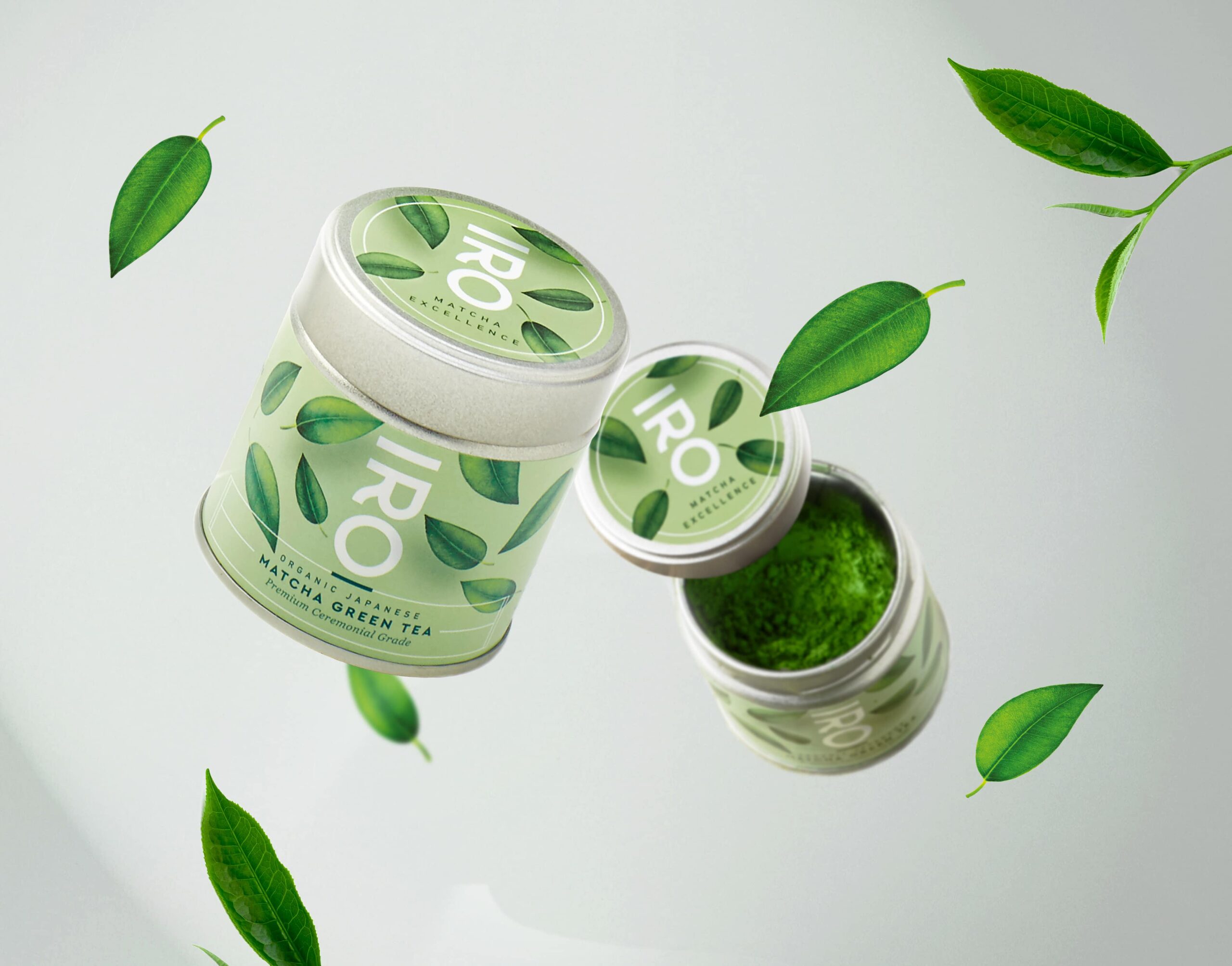
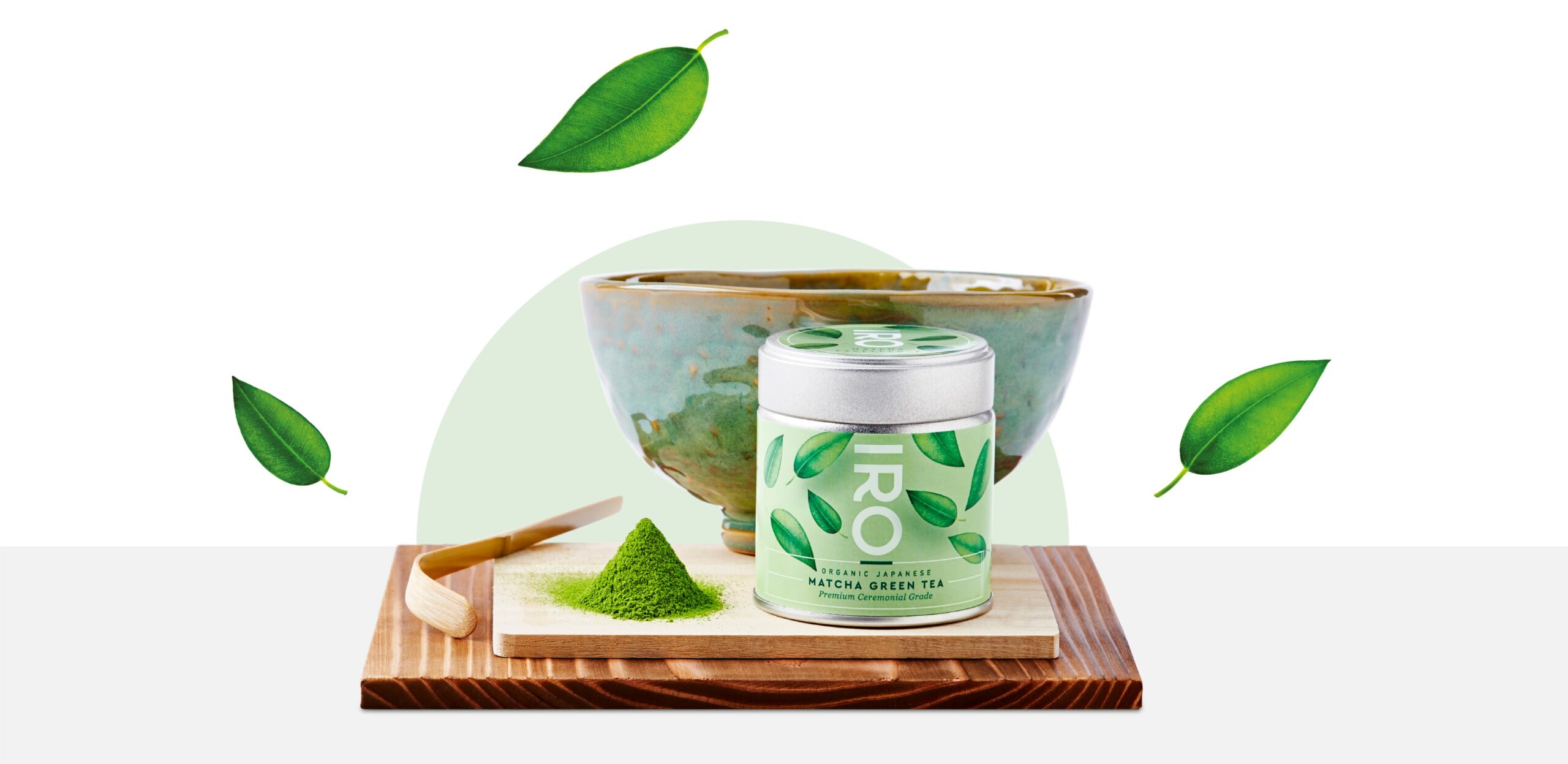
Natural elegance
Prestige packaging for drinking matcha
Drinking matcha is a high-quality organic tea, known for its refreshing and invigorating properties. The packaging design has been carefully crafted to evoke well-being and purity, with soft, natural hues that invite serenity. Each detail of the packaging reflects the exceptional quality of the product: from eco-friendly materials to meticulous finishes, and clean illustrations that highlight the delicate and authentic flavors of the tea. This approach not only ensures an attractive presentation but also a consistent and enriching user experience, true to the spirit of matcha.


4
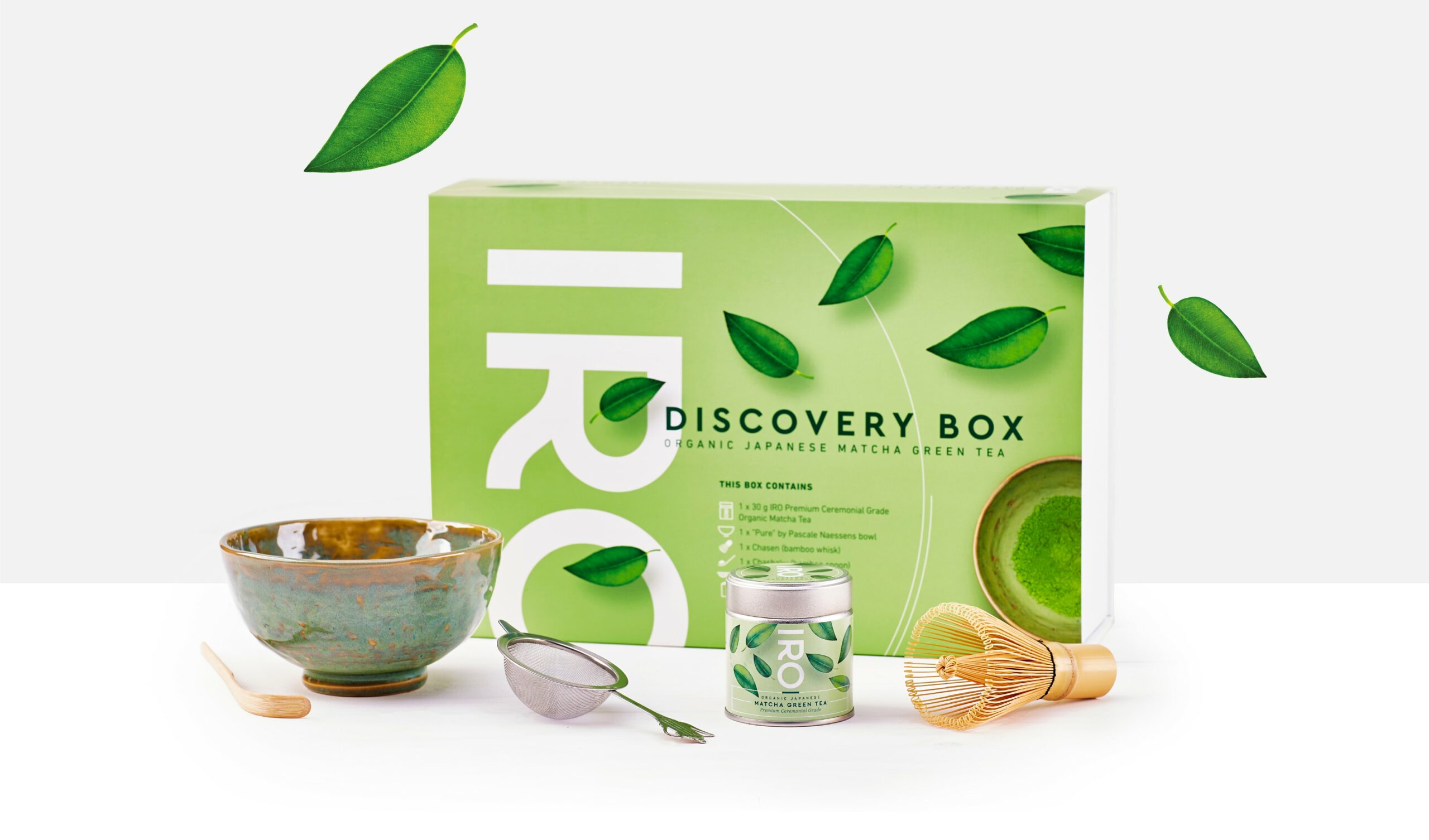
Purity and excellence
Discovering the essence of IRO through its discovery set
An invitation to explore matcha products, this set symbolizes the quintessence of the IRO universe. The simplicity of its packaging, a white box surrounded by a sleeve, echoes the brand’s desire to always focus on quality in the simplest way possible. This clean design is not just about aesthetics; it also reflects IRO’s commitment to providing an authentic and high-quality experience, highlighting the premium nature and benefits of matcha through a minimalist yet elegant presentation.

5
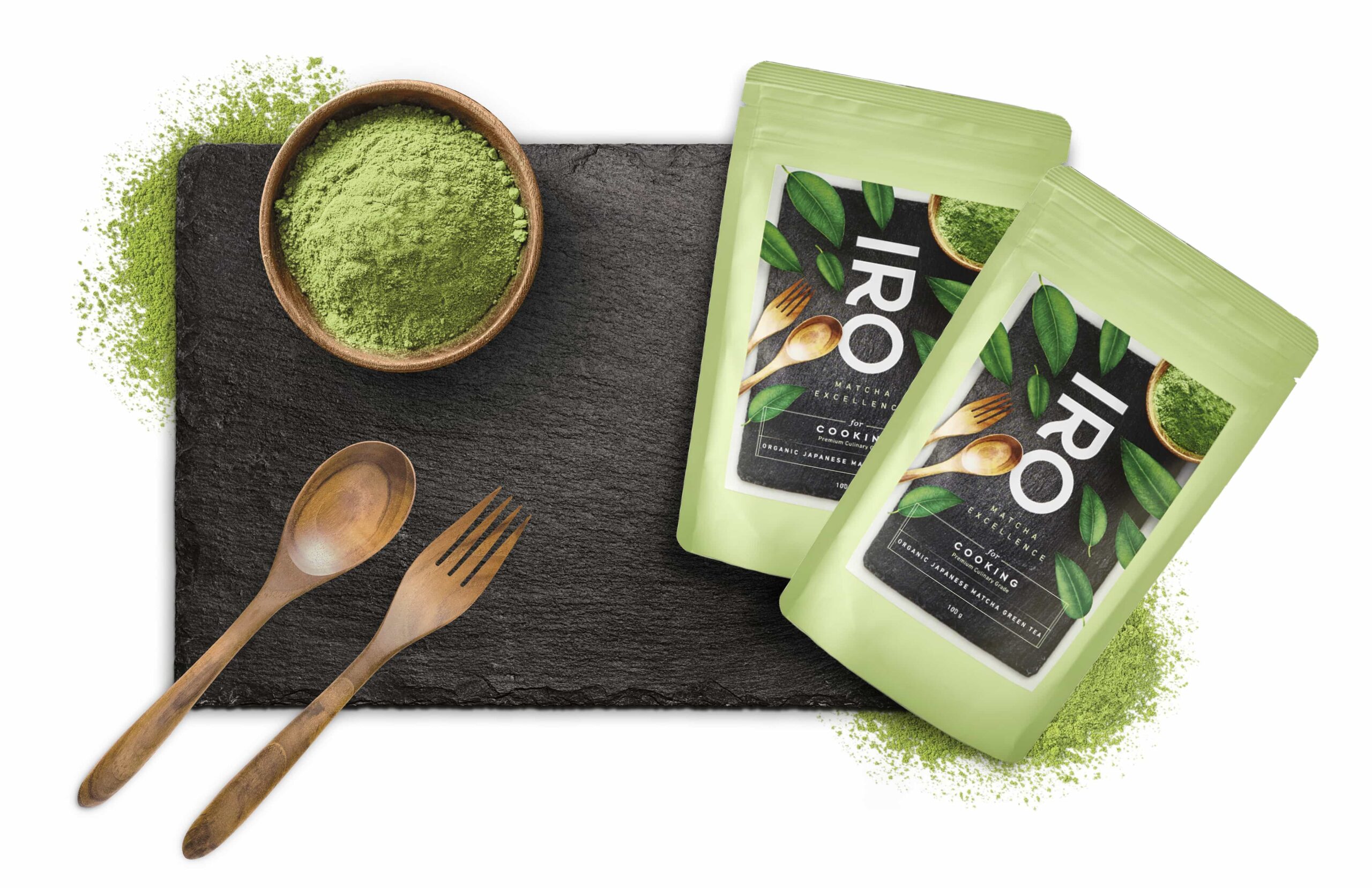
Culinary creativity
Packaging that invites innovation
The packaging of “IRO for cooking” reflects IRO’s values – sobriety, freshness, well-being – while suggesting a creative opening, illustrated by the slate: “Write your own matcha recipe”.


Iro
Scroll